|
This is my painting of spooky trees. First I drew the 3 layers of trees. I used a mixture of pink, white and orange to make the background a little color. Then I painted the furthest layer a light blue, the next layer I painted a darker blue and on the final layer I used a dark purple. This shows value and makes the painting look realistic. By painting each layer darker then the one behind it, it shows the space and value. After this I used a light purple in the first layer to paint in details on the branches and roots and I did this with every layer with a slightly dark color. After this I added in the dots, I used pink and red, going around the branches and trees to show value and space to form depth. 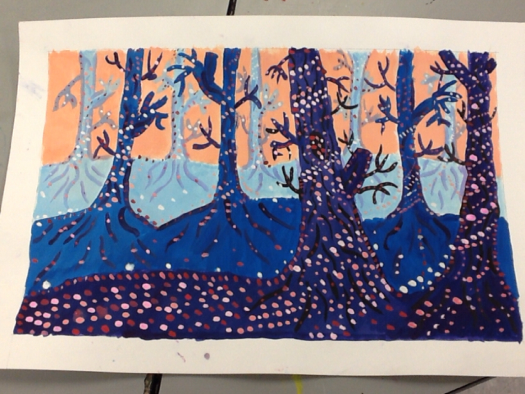 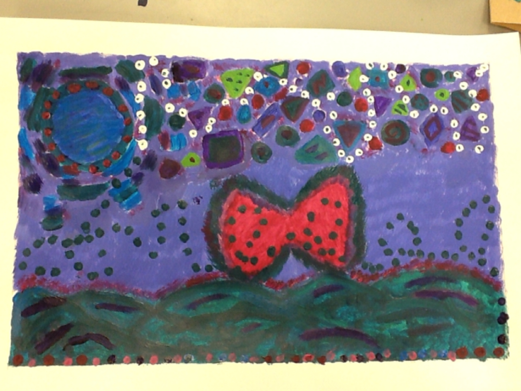 This is my Dreamtime painting. The painting is of the beach at night with angel wings in the center. The dark colors at the bottom represent the dark ocean. I also made the circle in the top left corner dark to represent the moon. As for the shapes at the top represent stars. The wings and dots show ones path at the beach then going up into the sky. The dots start in the bottom left corner and zig zag across the paper to the top right corner, showing the long path. The message of my painting is losing my grandmother and our favorite place was the beach. 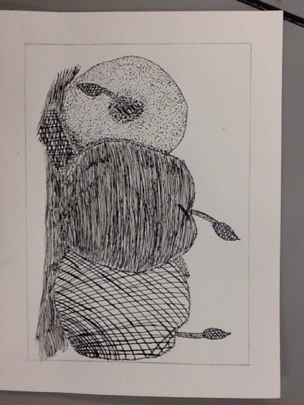 This is my independent project of apples in ink. I used stippling to outline the apples, stem of the leaves and the outline of the leaves. Then I used crossed hatching underneath one of the apples to form shadows. Then on one of the apples I also used cross hatching to show value I made the ink darker and lines closer together at the bottom. Then for the middle apple I used hatching and made the ink dark and the lines very close together to show shadows. And on the last Apple I used stippling and made the dots closer and dark towards the middle of the pit and the shadows to show depth and make it look 3D This is my final multicolored print of a seashell. After carving the shell out I used the back of my block and put yellow and pink ink, then printed it on the paper. Then I rolled turquoise and purple on the front side of my print putting it on top of the other colors. 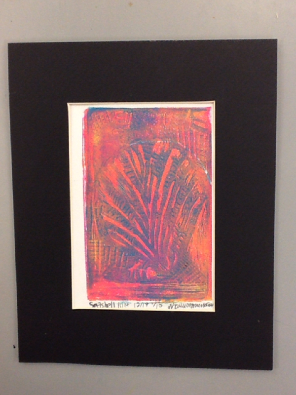 This is a photo of my final prints. I carved out my block using cross hatching, hatching and stippling to show value. On the shell I used hatching and stippling then in the background I used cross hatching and stippling to make the shell stand out. 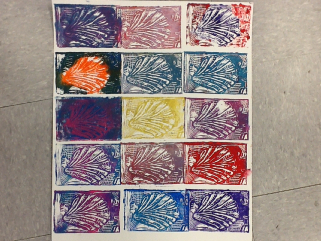 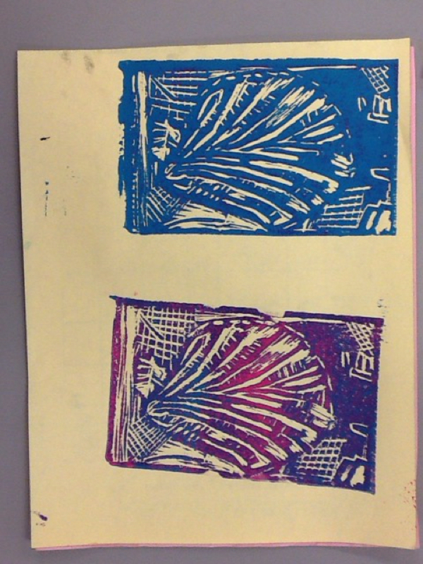 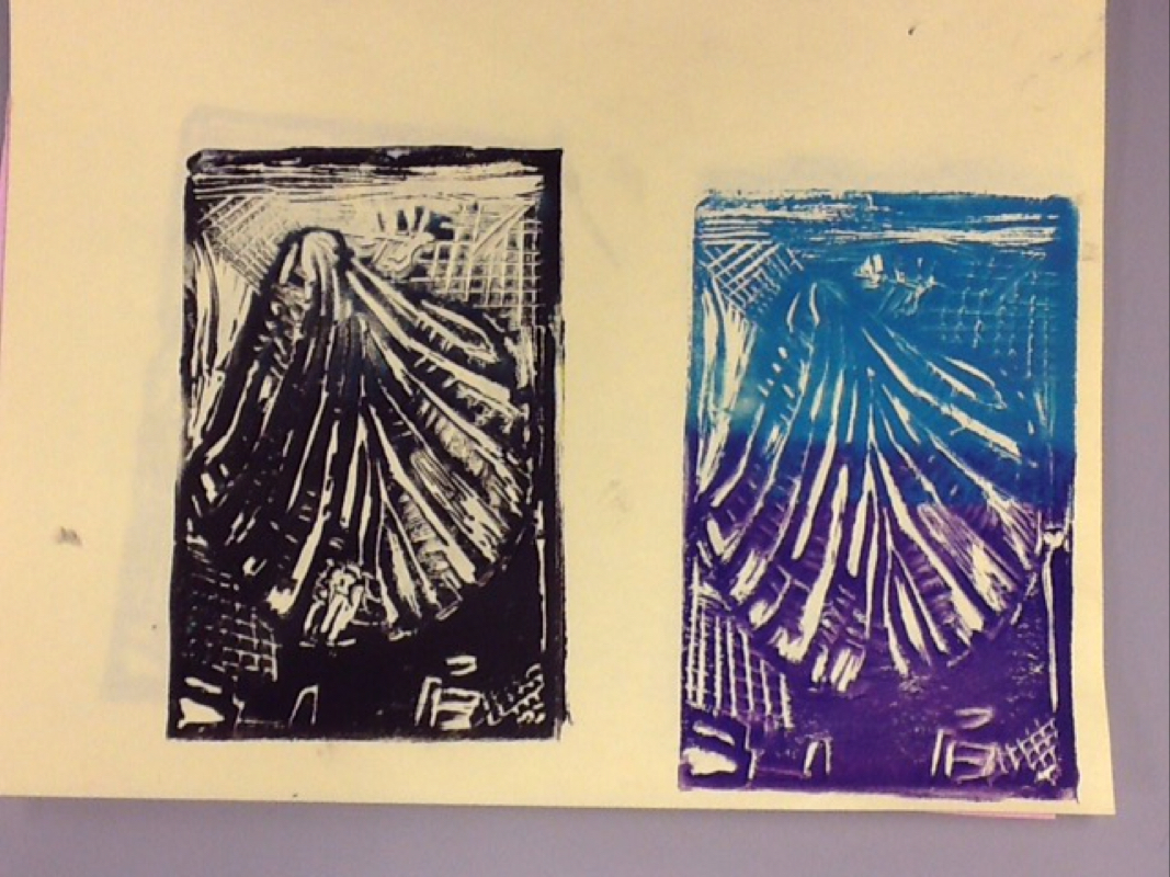 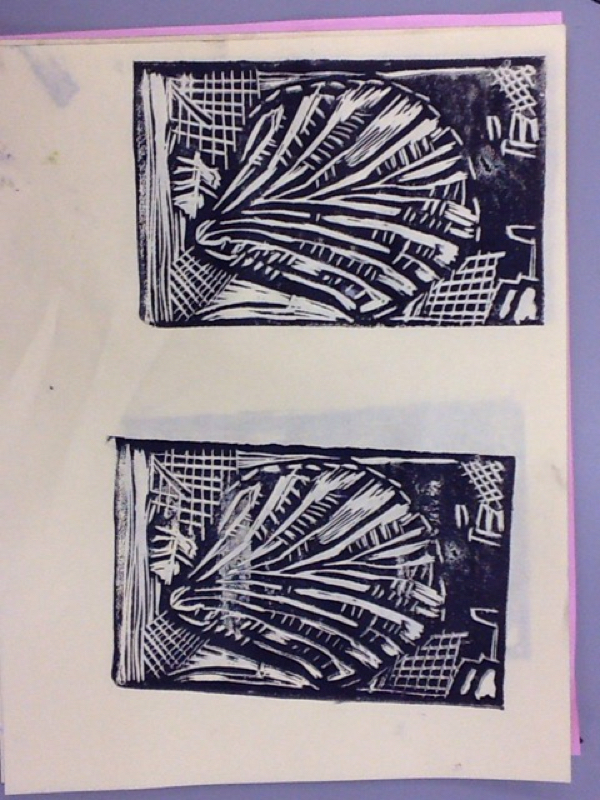 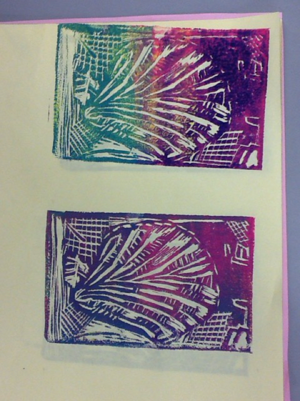 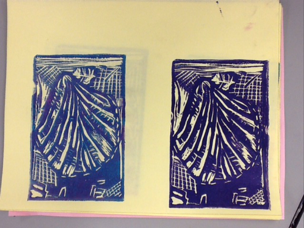 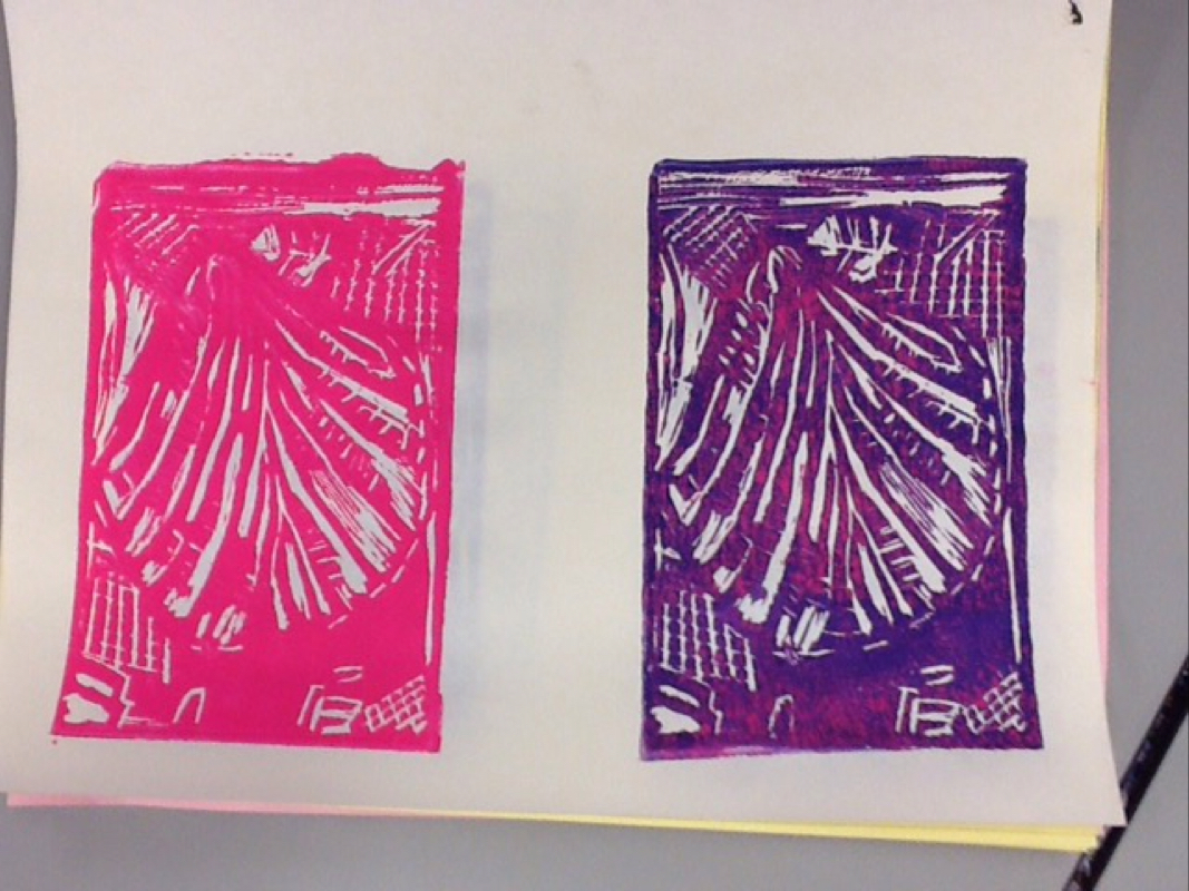 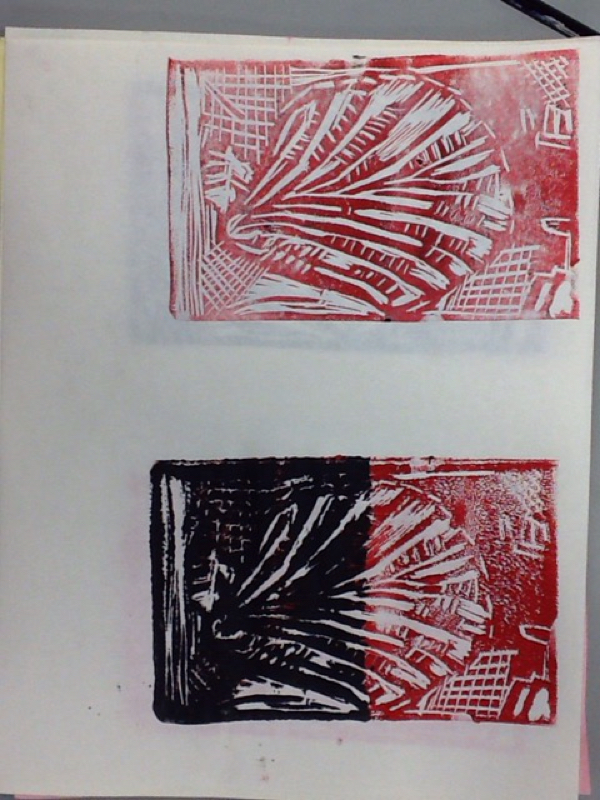 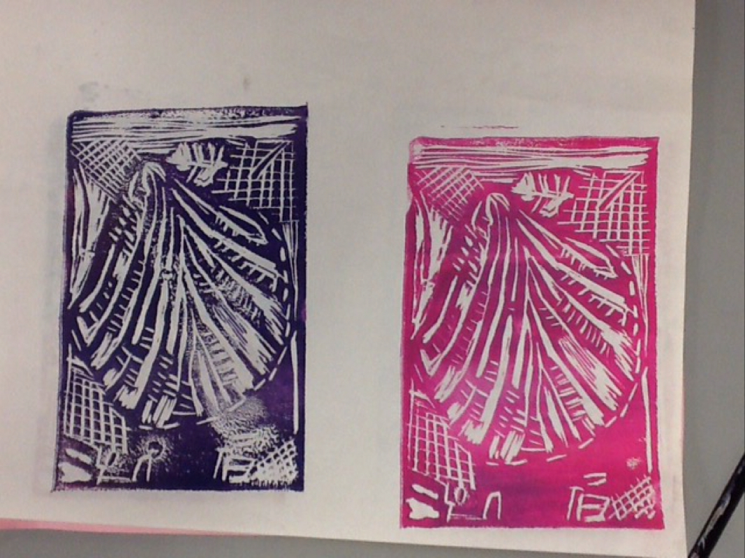 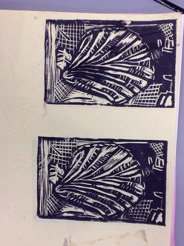 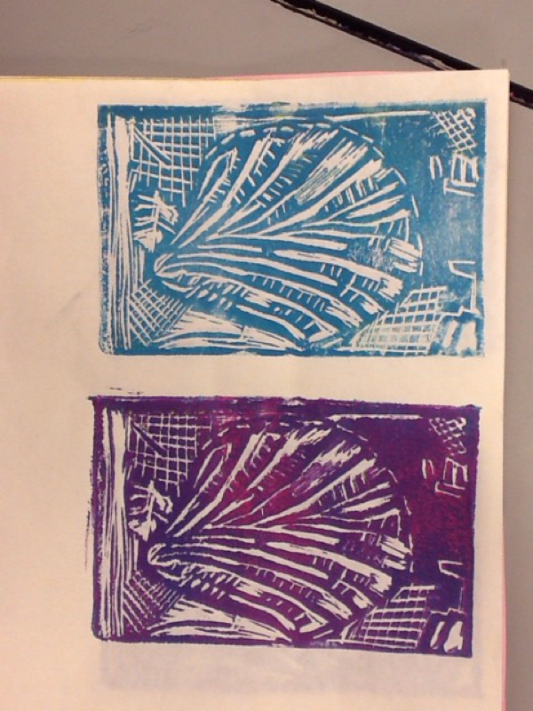 This is my ink drawing. First I drew the major shape of the shell. After this I used stippling to make the main shape of the shell. Then using hatching to show texture and show what part of the shell is higher. After this I used cross hatching towards the bottom of the shell to show how dark the shell is in that area. Then I added more stippling towards the bottom of the shell on the outside to show the value and darkness in that area. Then I used to stippling to fill in the lines in the hand and used light stippling to fill in the entire background. 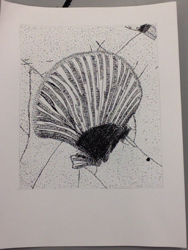 This is my landscape painting. I painted a photo of Mount Si with snow on it. First I drew out the main shapes in the photo, the mountain, clouds and grass. After this I used light colored paint to make the base colors or the grass, mountain, and sky. After this I used other colors to paint on top to make the colors in the painting match the photo. After painting everything I dabbed on white paint for the clouds and snow, and the texture makes the photo look more realistic. 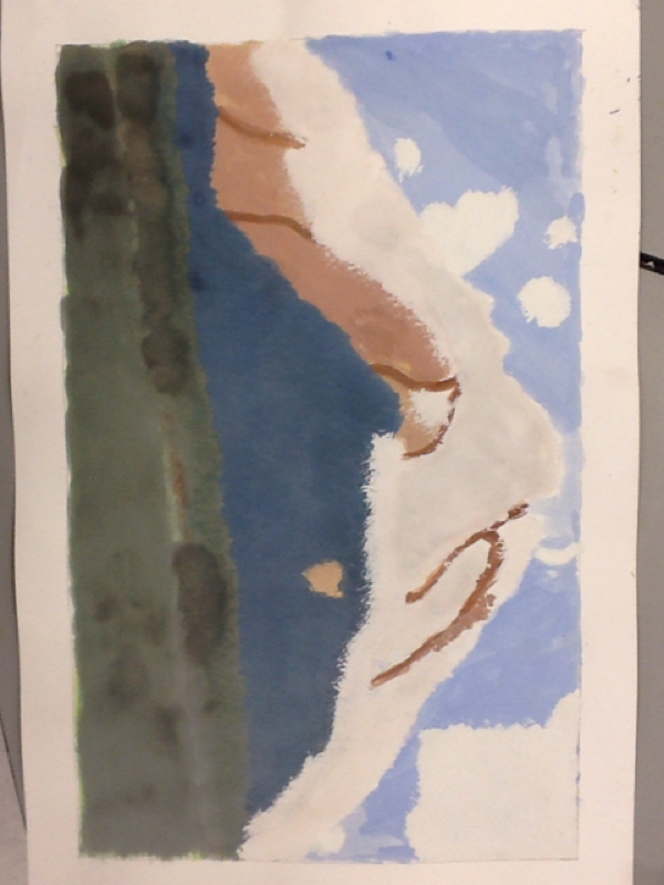 This is my portrait painting. First I drew the shape of my head, eyes, nose and mouth. Then I started painting, first the skin tone mixing peach with brown and making the shadows under the nose, neck and eyes darker than the rest. Then highlight on the tip of the nose and forehead. This created value giving the painting a more realistic look. Then I painted the hair yellow, then on top of that brown. This also gives the painting a realistic appearance. Finally I added color to the lips the top darker than the bottom. 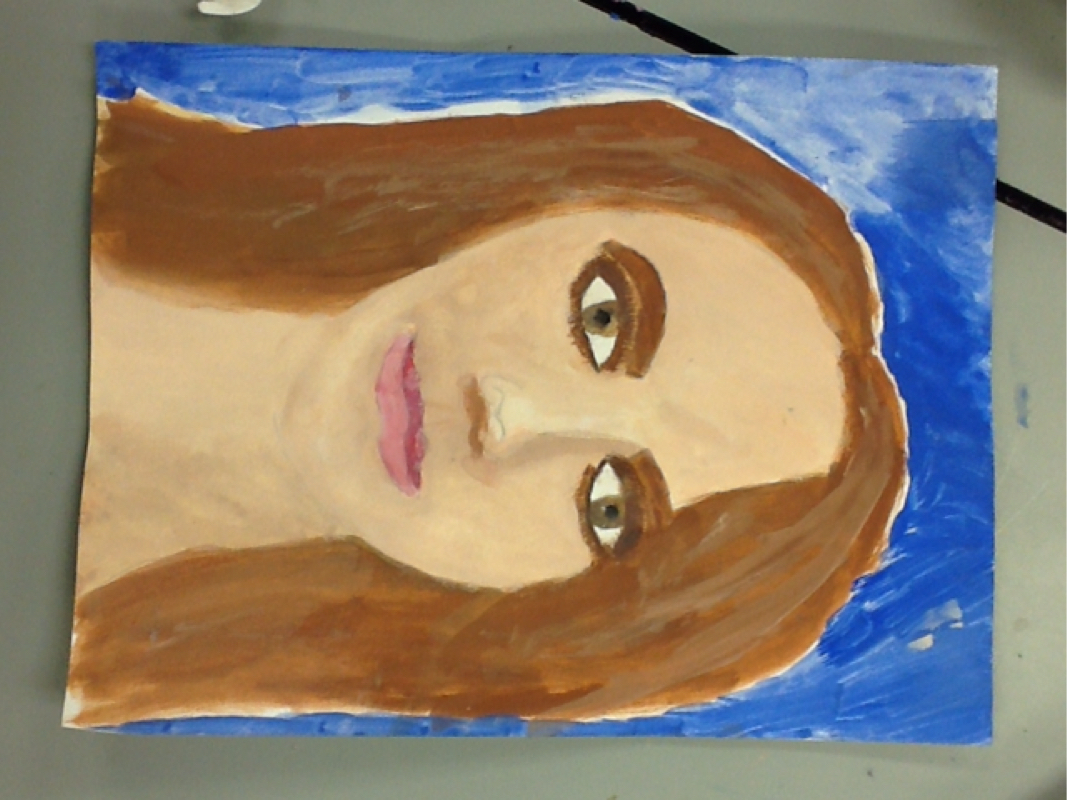 This is my self portrait. I used a rectangle, then drawing an oval as the shape of my head inside. After this I placed my eyes, nose, and lips. Drawing everything symmetrical, after these were finished I added detail. I added shading for the shadows of my face, for example under the bottom lip, on the side of the nose , and under the neck. Then I added highlights in the eyes and above them, also on the bottom lip. Doing this makes the portrait look more realistic 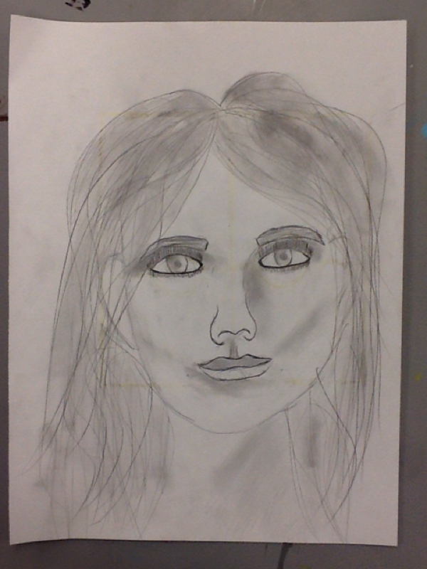 |
AuthorWrite something about yourself. No need to be fancy, just an overview. ArchivesCategories |
 RSS Feed
